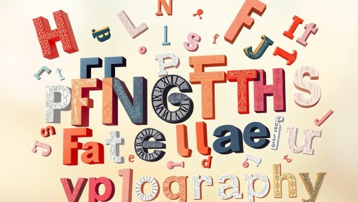
Typography is an art form that transcends mere text. It is the visual representation of language, bringing words to life in a way that can evoke emotions, convey meaning, and enhance communication. In today’s digital landscape, where attention spans are shorter than ever, the significance of typography design cannot be overstated. This blog post will explore the essential elements of typography design, its impact on user experience, and tips for mastering this crucial aspect of visual communication.
**Understanding Typography Basics**
At its core, typography involves the arrangement of type to make written language legible, readable, and visually appealing when displayed. Essential elements of typography include font choice, size, line spacing (leading), letter spacing (kerning), and alignment. Each of these components plays a vital role in how text is perceived and understood.
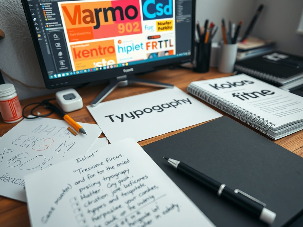
Font choice is perhaps the most critical element of typography. With thousands of fonts available, selecting the right one can significantly influence the tone and personality of your design. For instance, a sleek sans-serif font can evoke a sense of modernity and professionalism, while a whimsical serif font may convey creativity and warmth. Understanding the psychological implications of different fonts is crucial for effective design.
**The Importance of Readability and Legibility**
Readability and legibility are two terms often used interchangeably, but they have distinct meanings in typography. Legibility refers to how easily individual characters can be distinguished from one another, while readability relates to how easily words and blocks of text can be read and understood.
When designing for digital platforms, ensuring that your typography is both legible and readable is essential. This means choosing appropriate font sizes, using sufficient contrast between text and background, and maintaining optimal line spacing to facilitate smooth reading. For example, a body text size of at least 16 pixels is recommended for web content, with adequate line height to improve readability.
**Hierarchy and Structure in Typography**
Creating a clear hierarchy within your typography helps guide the reader’s eye and emphasizes the most important information. This can be achieved through the use of different font sizes, weights, and styles. For instance, headings should be larger and bolder than body text to signal their importance.
Utilizing typographic hierarchy not only improves user experience but also enhances the overall aesthetic of your design. Consider using variations in typeface to distinguish between sections of content. For example, using a bold typeface for headings, a regular weight for body text, and an italic style for quotes can create a visually appealing structure that draws the reader in.
**Whitespace: The Unsung Hero**
Often overlooked, whitespace (or negative space) is a fundamental aspect of typography design. Whitespace refers to the empty areas around and between elements in a design. It is essential for creating balance, emphasizing important content, and improving readability.
In typography, effective use of whitespace can make your design feel more organized and less cluttered. By allowing sufficient space around text blocks, you can create a more inviting reading experience. This is particularly important in digital media, where users are easily overwhelmed by excessive information.
**Responsive Typography for the Digital Age**
With the increasing use of mobile devices, responsive typography has become a necessary consideration in modern design. Responsive typography ensures that text is easily readable across various screen sizes and resolutions. This can involve using relative units like ems or percentages rather than fixed units like pixels, allowing text to scale appropriately on different devices.
Incorporating fluid typography, where font sizes adjust dynamically based on the viewer’s screen size, is another effective strategy. This ensures that your design remains functional and aesthetically pleasing, regardless of how it is accessed.
**Conclusion: Mastering Typography Design**
Typography design is a powerful tool that can significantly influence how messages are communicated and received. By understanding the fundamental principles of typography—including font choice, readability, hierarchy, whitespace, and responsive design—you can create visually compelling and effective designs.
As you continue to explore the world of typography, remember to experiment with different styles and techniques. The more you practice and refine your skills, the more adept you will become at using typography to enhance your designs and captivate your audience. Embrace the art of typography, and unlock the potential of your written communication!
Laura Kim
Thanks for sharing these tips! I always overlooked whitespace, but now I see how it can enhance the overall design. Typography is truly an art form that deserves more attention!
Emily Johnson
This post really highlights the importance of typography in design! I never realized how much font choice could affect the tone of my work. Thanks for the tips on readability and hierarchy!
David Smith
Great read! I’ve been designing for a while, but this post reminded me of the finer details that can make a huge difference. I’ll be more mindful of legibility and hierarchy moving forward.
Samantha Lee
I love how you broke down the basics of typography. The section on responsive typography is especially relevant in today’s mobile-first world. I’ll definitely be applying these principles to my projects!
Michael Brown
Fantastic insights on typography! I often struggle with choosing the right fonts, and your explanation of the psychological implications really helps. Also, I appreciate the emphasis on whitespace—it’s so crucial for clean design!