Typography is more than just arranging letters on a page; it is a vital component of design that can influence perception, mood, and readability. As we delve into the world of typography design, we uncover its significance in various mediums, from digital interfaces to print materials. Understanding typography allows designers to craft visual messages that resonate with audiences, creating a harmonious blend of art and communication.
One of the foundational aspects of typography is the typeface itself. A typeface encompasses the visual design of letters and characters, which can evoke different emotions and responses. For instance, serif typefaces, such as Times New Roman or Georgia, often convey a sense of tradition and reliability, making them suitable for formal documents or literature. In contrast, sans-serif typefaces like Helvetica or Arial are seen as modern and clean, often favored in tech-related industries or contemporary branding.
When selecting a typeface, it is essential to consider the context in which it will be used. Different applications require different typographic choices. For example, a playful typeface may work well for a children’s book or a fun event invitation but could undermine the seriousness of a financial report. Thus, understanding the target audience and the message is crucial for making informed typographic decisions.
Another critical element of typography design is hierarchy. Hierarchy helps guide the reader’s eye through the content, emphasizing the most important information. By varying font sizes, weights, and styles, designers can create a visual hierarchy that indicates the relationship between different pieces of information. For instance, using a larger, bold font for headings and a smaller, regular font for body text establishes a clear path for readers to follow. This technique not only enhances readability but also helps in organizing information logically.
Moreover, line spacing, or leading, plays a significant role in the overall readability of text. Proper leading ensures that the text does not feel cramped, allowing the reader to navigate through lines smoothly. A general rule of thumb is to keep the leading 1.5 times the font size for optimal readability. On the flip side, too much leading can create disjointedness in reading, making it hard for the audience to connect ideas. Finding the perfect balance is essential to effective typography.
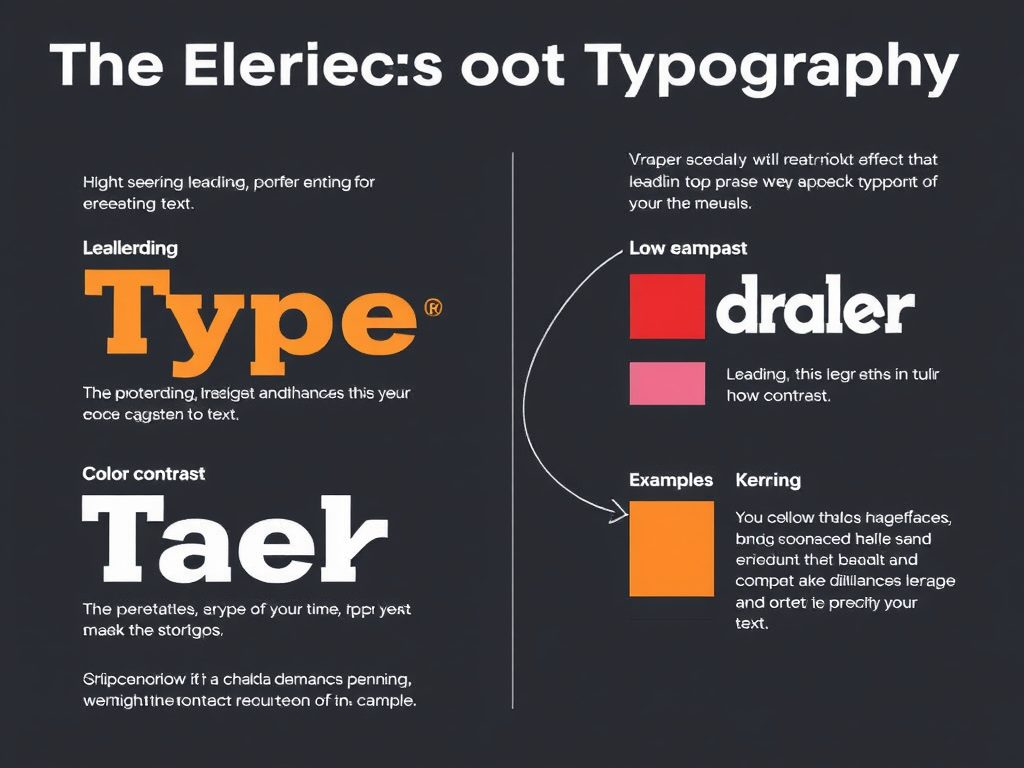
Additionally, kerning, or the space between individual characters, can significantly impact the effectiveness of typography. Proper kerning ensures that letters are spaced in a way that feels natural to the reader. Poor kerning can lead to words that look awkward or unprofessional, which can detract from the overall design. Designers should pay close attention to kerning, especially in logos or branding materials, where first impressions matter immensely.
Color also plays an essential role in typography design. The choice of color can affect readability and evoke certain feelings or actions. High contrast between the text color and the background color can enhance readability, while low contrast may lead to eye strain. Furthermore, colors have psychological effects that can influence how a message is perceived. For instance, blue can evoke feelings of trust and calmness, while red can incite urgency or passion. Thus, the careful selection of color in typography can enhance the effectiveness of the design.
In the digital age, responsive typography has become increasingly important. This concept ensures that text remains legible and aesthetically pleasing across various devices and screen sizes. With the rise of mobile browsing, designers must consider how typography will appear on smartphones, tablets, and desktops. Techniques such as fluid typography, which adjusts the font size based on the screen size, can help maintain readability and design integrity.
In conclusion, typography design is a crucial aspect of visual communication that blends art with functionality. By understanding typefaces, hierarchy, spacing, color, and responsiveness, designers can create effective and engaging typographic solutions. As we continue to explore the nuances of typography, it becomes clear that mastering this art form is essential for anyone looking to make a meaningful impact through design. Typography is not just about making things look good; it’s about creating a connection between the message and the audience, ensuring that every letter speaks volumes.
Emily Johnson
This post beautifully highlights the importance of typography in design! I never realized how much the choice of typeface can affect the mood and perception of a message. Thank you for sharing these insights!
Sarah Lee
Great article! I love how you explained the psychological effects of color in typography. It’s amazing how much thought goes into these design choices. Looking forward to applying some of these techniques!
Michael Smith
I appreciate the section on kerning and leading. It’s fascinating how such small adjustments can make a huge difference in readability. This is definitely something I’ll keep in mind for my next project!
David Brown
The discussion on responsive typography is so relevant today with all the different devices we use. Thanks for the tips on fluid typography! I can’t wait to experiment with it in my designs.
Jessica White
This was an enlightening read! I never fully understood the concept of hierarchy in typography until now. It’s clear that effective typography is key to good design. Keep up the great work!