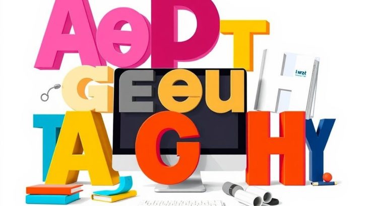
Typography is more than just arranging letters on a page; it’s an essential aspect of design that influences how we perceive written content. From the choice of fonts to the spacing between letters, typography plays a pivotal role in communication, setting the tone for the message being conveyed. In this post, we will explore the fundamental principles of typography design, its impact on user experience, and tips for creating effective typographic layouts.
At its core, typography encompasses the art and technique of arranging type to make written language legible, readable, and visually appealing. The choice of typefaces, line spacing, letter spacing, and even the alignment of text can dramatically alter how a message is received. For designers, understanding typography is crucial because it not only enhances aesthetics but also facilitates communication. A well-designed typographic layout can draw attention, evoke emotions, and guide the reader through content seamlessly.
One of the first things to consider in typography design is the selection of typefaces. Fonts can be broadly categorized into serif, sans-serif, script, and decorative styles. Serif fonts, characterized by their small lines or decorative strokes at the ends of letters, are often seen as more traditional and formal. They are commonly used in print media, such as books and newspapers, where readability is key. In contrast, sans-serif fonts, which lack these embellishments, are modern and clean, making them ideal for digital screens where clarity and simplicity are paramount.
When choosing a typeface, it’s essential to consider the message you want to convey. For instance, if you’re designing for a technology company, a sleek sans-serif font may communicate innovation and forward-thinking. Conversely, a serif font might be more appropriate for a law firm, as it conveys reliability and professionalism. The emotional response elicited by different typefaces can significantly impact how your audience perceives your brand or message.
Once you’ve selected your typefaces, the next step is to consider hierarchy. Hierarchy in typography refers to the arrangement of text elements to guide the reader’s eye through content in a meaningful way. This can be achieved through variations in font size, weight, and color. For example, larger and bolder text can signal headings or important information, while smaller text can indicate subheadings or body copy. By creating a clear hierarchy, you help your audience navigate your content more effectively, ensuring that key points stand out.
Another critical aspect of typography design is spacing. This includes both letter spacing (kerning) and line spacing (leading). Proper spacing can enhance readability and prevent text from feeling cramped or overwhelming. Too much space can create disconnection, while too little can make the text difficult to read. As a rule of thumb, aim for a comfortable balance that allows for easy scanning without sacrificing visual appeal. Additionally, consider the overall layout of your design. Aligning text to the left is often the most natural for readers, but centered or justified text can create a different aesthetic depending on the context.
In the digital age, responsive typography has become increasingly important. With users accessing content on various devices, from smartphones to large desktop monitors, ensuring that your typography adapts to different screen sizes is essential. This may involve using fluid typography techniques, such as relative units (like ems or rems) for font sizes, allowing your text to scale appropriately regardless of the device.
Finally, it’s essential to stay updated with typography trends and practices. Design is an ever-evolving field, and what was once considered modern may become dated quickly. Regularly exploring new typefaces, tools, and design techniques can inspire creativity in your projects and keep your designs fresh and relevant. Websites like Google Fonts and Adobe Fonts offer vast libraries of typefaces that can be easily integrated into your design workflow.
In conclusion, typography design is a vital component of effective communication. By understanding the principles of type selection, hierarchy, spacing, and responsiveness, designers can create visually compelling and user-friendly content. Whether you’re working on a website, a print project, or social media graphics, the right typography can elevate your design and enhance your message. Embrace the art of typography, and watch as your designs transform into powerful communication tools.
David Kim
This article is a must-read for anyone in design! Typography is such an underrated element, yet it can make or break a design. I can’t wait to apply these principles to my own work.
Michael Patel
I love how you’ve explained the emotional impact of different typefaces. It’s true that the right font can really set the tone for a brand. I’ll definitely be more mindful of my font choices in future projects.
Jessica Lee
Great insights! I especially appreciate the section on typography hierarchy. It’s something I often overlook, but it’s crucial for guiding the reader’s eye. Thanks for sharing these tips!
Samantha Green
Such a comprehensive guide! The part about responsive typography is particularly relevant today. With so many devices out there, it’s essential to ensure that our designs look great everywhere.
Alex Thompson
This post really highlights the importance of typography in design! I never realized how much thought goes into selecting fonts and spacing. It’s amazing how much a small change can affect the overall perception of a message.