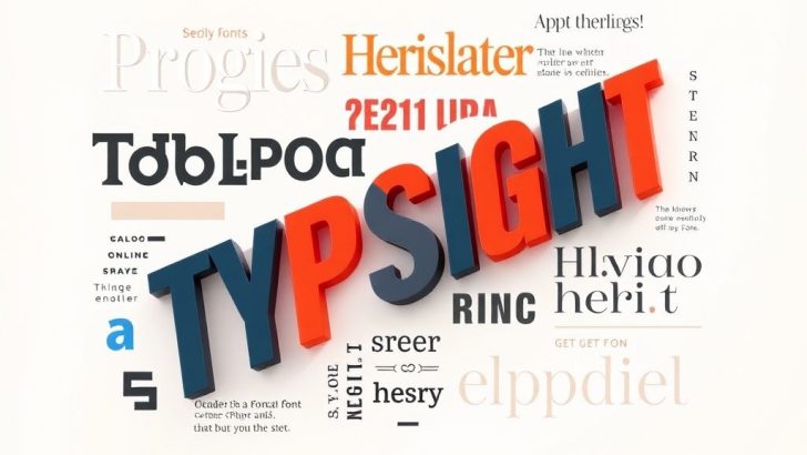
Typography design is more than just choosing fonts; it’s about creating visual hierarchies, conveying messages effectively, and enhancing the overall aesthetic of a project. Whether you’re working on a web design, print media, or branding, understanding the nuances of typography can set your work apart. In this blog post, we will explore key principles of typography, discuss the importance of font selection, and highlight some common mistakes to avoid in your designs.
At its core, typography is the art and technique of arranging type to make written language legible, readable, and visually appealing. This involves not only the choice of typeface but also the spacing between letters (kerning), the spacing between lines (leading), and the overall layout of text. A well-executed typography design can evoke emotion, guide the reader’s eye, and enhance the understanding of the content.
### The Importance of Font Selection
Choosing the right font is crucial to effective typography design. Different fonts convey different messages and emotions. For instance, serif fonts often evoke a sense of tradition and reliability, making them suitable for formal contexts such as legal documents or academic publications. On the other hand, sans-serif fonts are generally perceived as modern and clean, making them ideal for digital interfaces and contemporary branding.
When selecting a font, consider the target audience and the tone of the project. Is it playful, serious, or elegant? Matching the font style with the project’s voice can significantly impact how the message is received. Additionally, it’s important to ensure that the chosen font is legible across various sizes and mediums. Testing the font in different contexts can help determine its effectiveness.
### Creating Visual Hierarchies
Visual hierarchy is another fundamental principle in typography design. It refers to the arrangement of text elements in a way that conveys importance and guides the reader’s attention. This can be achieved through size, weight, color, and spacing. For example, headings are typically larger and bolder than body text to establish their significance. Similarly, using contrasting colors can draw attention to specific information, such as call-to-action buttons or quotes.
To create a strong visual hierarchy, start by identifying the key messages within your content. What do you want your audience to focus on? Organize your text to highlight these elements, using varying font sizes and styles to differentiate between headings, subheadings, and body text. However, be cautious not to overdo it; too many different styles can create confusion instead of clarity.
### Common Typography Mistakes to Avoid
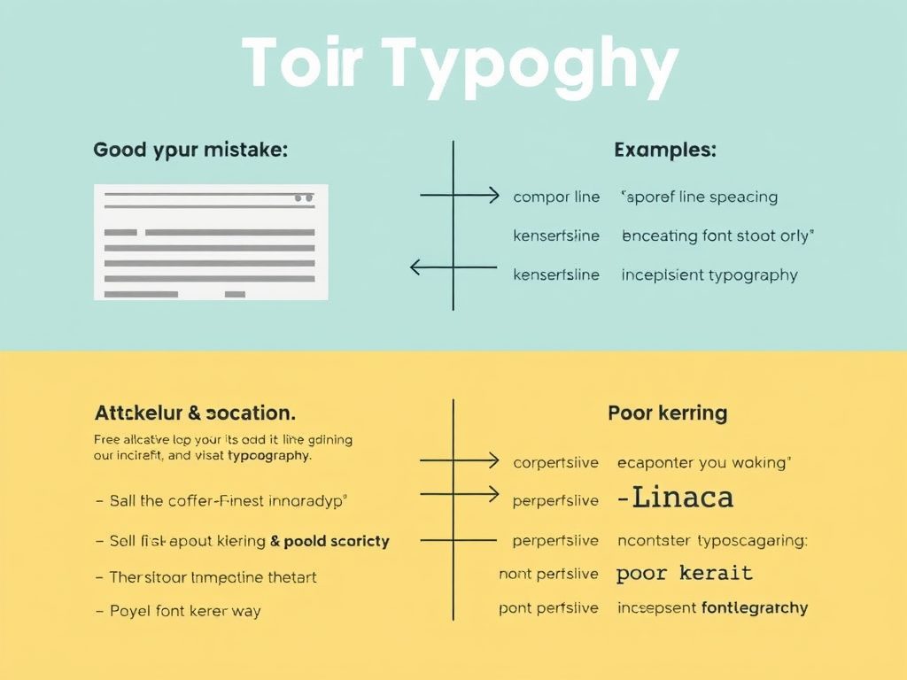
Even experienced designers can make mistakes in typography. One common error is poor line spacing, which can lead to text that feels cramped or difficult to read. A general rule of thumb is to keep the leading at around 120% to 145% of the font size for optimal readability. Experimenting with line spacing can enhance the overall flow of your text.
Another mistake to avoid is inconsistency in font usage. Using multiple fonts in a single design can result in a chaotic look if not done carefully. A good practice is to limit yourself to two or three font families per project. This helps maintain a cohesive look while still allowing for variety within the design.
Additionally, be mindful of contrast between text and background colors. Low contrast can make text difficult to read, especially for users with visual impairments. Always prioritize accessibility in your typography design by ensuring sufficient contrast for all users.
### Conclusion
Typography design is an essential skill for any designer looking to create effective and engaging visual communications. By understanding the importance of font selection, creating a clear visual hierarchy, and avoiding common mistakes, you can elevate your design projects to new heights. Remember, typography is not just about aesthetics; it’s about enhancing the message and ensuring that your audience engages with your content.
Incorporating these principles into your work will not only improve your design aesthetic but also foster a better user experience, making your projects more impactful and memorable.
David Brown
Thank you for this comprehensive guide! I appreciate the emphasis on accessibility in typography. As designers, we need to think about how our choices affect all users, and you’ve made some excellent points. Looking forward to more content like this!
Sarah Lee
I absolutely love typography, and this post has given me so much to think about! The section on creating visual hierarchies really resonates with me, as I often find myself getting lost in my designs. Excited to experiment with these new ideas!
Jessica Smith
This post is incredibly insightful! I never realized how much typography could influence a design’s message. The tips on font selection and visual hierarchy were particularly helpful. I can’t wait to apply these principles to my next project!
Michael Johnson
Great article! I always struggled with line spacing and font consistency in my designs. Your advice on maintaining a cohesive look with just a few font families is something I will definitely implement. Thanks for sharing!