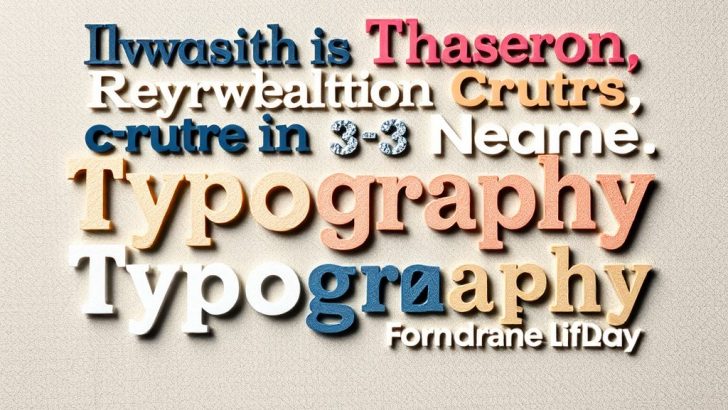
Typography is more than just the arrangement of letters; it is an art form that communicates messages and evokes emotions. As we delve into the world of typography design, we uncover its significance in branding, the intricacies of font selection, and the impact it has on user experience. Typography sets the tone for a piece of content and influences how the audience perceives the message being conveyed. From the classic serif fonts that exude tradition to the modern sans-serif styles that suggest minimalism, typography plays a crucial role in design across various platforms.
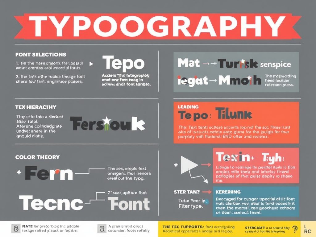
One of the primary aspects of typography is font selection. Choosing the right font can make or break a design. As designers, we must consider the purpose of the text and the audience it is intended for. For instance, a playful font may work well for children’s products, while a clean and professional typeface is more suitable for corporate branding. The choice of font not only affects readability but also creates an emotional connection with the audience. A well-selected font can enhance the message and significantly improve engagement.
Another critical element is the hierarchy of text. Hierarchy in typography helps guide the reader through the content, making it easier to consume. It involves varying the size, weight, and style of fonts to indicate the importance of different sections. For example, larger fonts for headings and smaller, lighter fonts for body text create a visual order that helps readers navigate the information presented. Effective hierarchy not only improves readability but also enhances the overall aesthetic of the design, making it more appealing.
Leading, or line spacing, is another important aspect of typography that often goes unnoticed. The right amount of spacing between lines can dramatically affect how easy it is to read a block of text. Too little leading can make the text feel cramped and overwhelming, while too much can create disconnection between lines. Striking the right balance is essential, as it allows the reader to flow comfortably from one line to the next. As a rule of thumb, a leading value of 1.2 to 1.5 times the font size is generally recommended for optimal readability.
Moreover, kerning, which refers to the spacing between individual characters, plays a significant role in the overall appearance of text. Proper kerning ensures that letters are evenly spaced, preventing awkward gaps that can distract the reader. This meticulous attention to detail is what elevates good typography to great typography. Designers should always strive for consistency in kerning, particularly in headlines where the impact of the text is most prominent.
In recent years, the rise of digital design has brought about new challenges and opportunities for typography. With the increasing importance of mobile devices, responsive typography has emerged as a critical consideration. Designers must ensure that text remains legible and visually appealing across various screen sizes. This often involves using scalable units and media queries to adjust font sizes and layouts dynamically. By embracing responsive typography, designers can enhance user experience and accessibility, making content more engaging for all audiences.
Color is another powerful tool in typography design. The choice of color can evoke different emotions and set the mood for the text. For example, warm colors like red and orange can create a sense of urgency or excitement, while cooler shades like blue and green can evoke calmness and trust. When combining color with typography, designers must also consider contrast to ensure legibility. High contrast between the text and background is essential for readability, particularly for individuals with visual impairments.
In conclusion, typography design is an intricate blend of art and science that requires thoughtful consideration of various elements. From font selection and hierarchy to spacing and color, every choice impacts how the audience perceives the message. As designers, we have the power to shape experiences through typography, making it a vital skill to master. Whether you are designing a website, a logo, or print materials, understanding the principles of typography will elevate your work and enhance communication with your audience. Embrace the art of typography, and watch as your designs come to life with clarity and purpose.
James Miller
Great insights on typography! I particularly appreciate the section on leading and kerning. These details can truly make a huge difference in design. Thank you for sharing!
Sophie Nguyen
I never realized how much typography affects user experience. The tips on responsive typography are especially helpful for those of us working on mobile designs. Keep up the fantastic work!
Emily Carter
This post beautifully captures the essence of typography! I love how you emphasized the emotional connection fonts can create. It’s so important to choose the right typeface for effective communication.
Ava Smith
I love your perspective on color in typography! It’s fascinating how different colors can change the mood of the text. Thanks for this informative read!
Michael Johnson
This article is a fantastic resource for designers! The breakdown of font selection and hierarchy is spot on. Typography is such an art form, and your insights are invaluable.