Typography is more than just a tool for communication; it is an essential element in branding and design that can significantly influence how your audience perceives your message. In today’s visually driven world, effective typography can elevate your brand, making it more memorable and impactful. This blog post will explore the fundamental aspects of typography design, its importance in branding, and how you can leverage it to create a lasting impression.
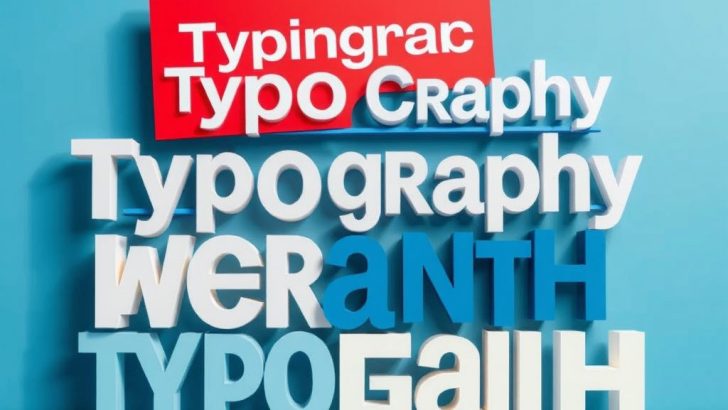
At its core, typography involves the art and technique of arranging type in a way that makes written language legible, readable, and visually appealing. This includes the choice of typefaces, font size, line length, spacing, and color. Each of these elements contributes to the overall aesthetic and functionality of a design. A well-crafted typographic design can convey mood, evoke emotion, and direct attention, making it a powerful tool for any designer.
One of the most critical aspects of typography design is the selection of typefaces. The typeface you choose can dramatically change the perception of your brand. For instance, serif fonts often convey a sense of tradition and reliability, making them a popular choice for financial institutions and law firms. On the other hand, sans-serif fonts are associated with modernity and cleanliness, which is why tech companies and startups frequently opt for them. Script and decorative fonts can add a personal touch or a sense of whimsy, but they should be used sparingly to avoid overwhelming the viewer.
In addition to typeface selection, understanding typography hierarchy is vital for effective design. Hierarchy helps organize information, guiding the reader’s eye through the content in a structured manner. This can be achieved through variations in font size, weight, and color. For example, larger and bolder headings naturally draw the reader’s attention first, while smaller body text provides the necessary details. This clear distinction not only enhances readability but also helps communicate the importance of different pieces of information.
Spacing is another crucial factor in typography design. Proper spacing, including letter spacing (kerning), word spacing, and line spacing (leading), can greatly affect the readability of text. Too much or too little space can lead to confusion and frustration for the reader. As a rule of thumb, aim for sufficient white space around your text to allow it to breathe and create a clean, professional look. This not only improves legibility but also enhances the overall aesthetic appeal of your design.
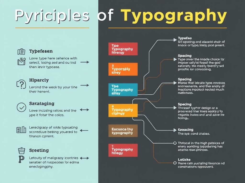
Color choices in typography also play a significant role in branding. The color of your text can convey different emotions and messages. For instance, blue often represents trust and professionalism, while red can evoke passion and urgency. When choosing colors for your typography, consider your brand’s personality and the emotions you want to evoke in your audience. Additionally, make sure there is enough contrast between the text color and the background to ensure readability.
As the digital landscape evolves, so does typography design. With the rise of responsive design, it’s crucial to ensure that your typography is adaptable across different devices and screen sizes. This means selecting web-safe fonts, utilizing CSS for styling, and testing your designs on various platforms to maintain consistency and readability. The goal is to create a seamless experience for your audience, regardless of how they access your content.
In conclusion, typography design is an essential aspect of creating a strong brand identity. By carefully selecting typefaces, establishing a clear hierarchy, paying attention to spacing, and choosing the right colors, you can enhance your brand’s visual impact and foster a deeper connection with your audience. Whether you are a seasoned designer or just starting, mastering the principles of typography can set you apart in a crowded market and help you communicate your message more effectively. Remember, good typography is not just about aesthetics; it’s about creating an experience that resonates with your audience and reflects the values of your brand.
James Thompson
Great article! The section on typography hierarchy was particularly helpful. I’m definitely going to implement these tips in my next project. Keep up the good work!
Sara Li
I loved this post! Typography truly does make or break a design. I appreciate the practical advice on spacing and color choices. Very informative!
Emily Carter
This post really highlights the importance of typography in branding! I never realized how much a typeface could influence perception. Thanks for sharing these insights!
Michael Johnson
Thanks for breaking down the elements of typography design! I think many people overlook how critical it is for branding. This has inspired me to pay more attention to my typography choices.
Laura Kim
Fantastic insights on typography! I especially liked the point about color psychology. I’ll definitely consider this when working on my brand’s identity. Thanks for sharing!