Typography is more than just arranging letters on a page; it is the art and technique of composing type to make written language legible, readable, and visually appealing. As we delve into the world of typography design, we will explore its fundamental principles, the impact of font choices, and the importance of hierarchy and spacing in creating effective visual communication. Whether you are a seasoned designer or just starting, understanding typography can elevate your work and help you convey messages more powerfully.
The foundation of typography lies in its history. Typography originated with the invention of movable type in the 15th century, revolutionizing the way we share and consume information. Since then, typography has evolved dramatically, from the classic serif fonts of the past to the sleek sans-serif fonts of the modern digital age. Each typeface carries its own personality and can evoke specific emotions or responses from the audience. For instance, a bold sans-serif font might convey strength and modernity, while a delicate serif font might evoke elegance and tradition.
When selecting a typeface, it’s essential to consider the context in which it will be used. Different environments call for different typographic choices. For example, a playful font might work well for a children’s book, while a professional sans-serif font may be best suited for corporate branding materials. Understanding your audience and the message you want to communicate is crucial in making the right typographic decisions.
One of the most critical aspects of typography is hierarchy. Hierarchy in typography refers to the arrangement of type to show the importance of different elements within a design. By using varying sizes, weights, and styles of text, designers can guide the reader’s eye and emphasize key information. For example, larger headings signal to the reader that the information is important, while smaller body text provides additional details. This visual hierarchy not only aids in readability but also enhances the overall aesthetic of the design.
In addition to hierarchy, spacing plays a vital role in typography design. Proper spacing between letters (kerning), words (tracking), and lines (leading) can significantly impact how a message is perceived. Too much or too little space can create confusion and detract from the readability of the text. Designers need to pay close attention to these details to ensure that their typography is not only beautiful but also functional. A well-spaced design allows the reader to engage with the content effortlessly, making the information more accessible.
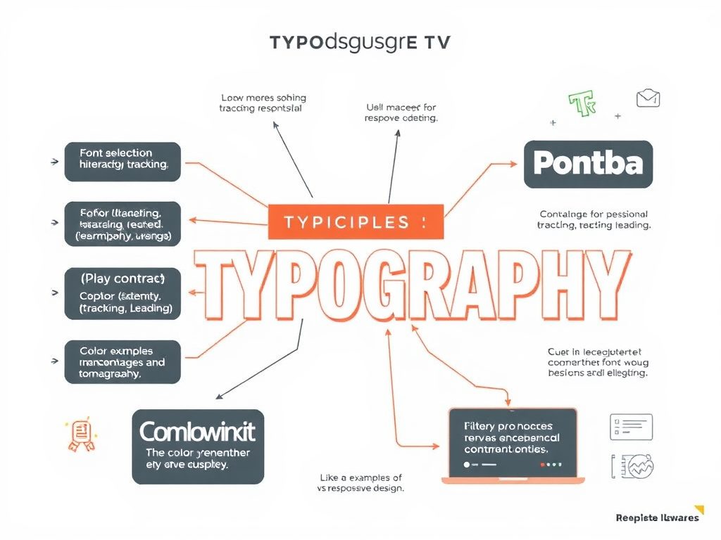
Color is another powerful tool in typography design. The color of text can evoke emotions and set the tone for the entire design. For instance, a bright red can create a sense of urgency, while a soft blue can evoke calmness and trust. However, it’s essential to ensure that the color contrast between the text and the background is sufficient for readability. Accessibility should always be a priority in design, ensuring that all audiences can engage with the content.
Moreover, the rise of digital media has transformed typography design. With the advent of responsive design, typography must now adapt to various screen sizes and resolutions. This has led to the development of web-safe fonts and the need for designers to consider how typography looks across different devices. Fluid typography, which adjusts the size of text according to the viewport, has become increasingly popular, ensuring that designs remain consistent and accessible regardless of how they are viewed.
In conclusion, typography design is an essential component of effective visual communication. It encompasses a range of elements, including font selection, hierarchy, spacing, and color. By mastering these principles, designers can create compelling designs that not only capture attention but also convey messages clearly and effectively. Whether working on a print project or a digital platform, understanding the nuances of typography can elevate your design work and enhance the overall user experience.
Emily Davis
Fantastic article! Typography is such a crucial element in design that often gets taken for granted. Your breakdown of spacing and its impact on readability is something I’ll definitely be sharing with my design team.
Samantha Lee
I appreciate the emphasis on accessibility in typography. It’s so important to ensure that everyone can read our designs. Thanks for sharing these valuable insights!
Mark Thompson
Great read! I’ve always struggled with choosing the right fonts for my projects. Your examples of different contexts are super helpful. I’ll definitely keep these tips in mind!
David Chen
I found the section on color in typography particularly interesting. It’s amazing how much emotion can be conveyed through font color. I’m excited to experiment with this in my next project!
Alice Johnson
This is such an insightful post! Typography really does have a profound impact on how we perceive information. I love how you highlighted the importance of hierarchy in design. It’s often overlooked!