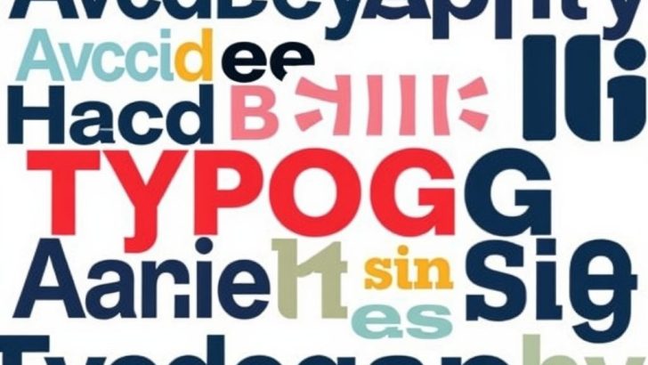
Typography is more than just the arrangement of letters on a page; it is a fundamental element of design that influences how information is perceived and understood. From the choice of font to the spacing between letters, every detail contributes to the overall aesthetic and functionality of a design. In this post, we will explore the nuances of typography design, its importance in visual communication, and how to master its principles to create compelling designs.
### Understanding Typography
At its core, typography is the study and design of typefaces. It encompasses everything from font selection to line spacing, letter spacing, and the alignment of text. Good typography is essential for creating a clear hierarchy in your design, guiding the reader’s eye through content smoothly. This is particularly important in a world where attention spans are shorter than ever. The right typography can capture attention, convey a message, and create an emotional response.
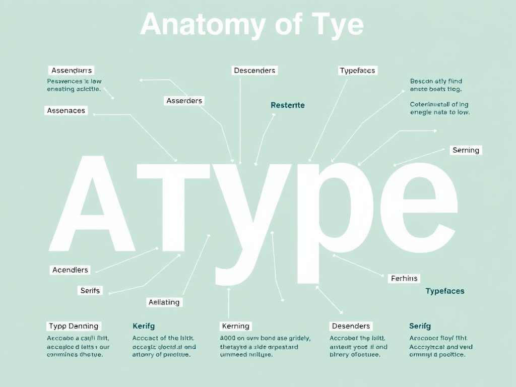
### The Anatomy of Type
To understand typography, one must familiarize themselves with the anatomy of type. Each typeface consists of various components, including ascenders, descenders, serifs, and kerning. Ascenders are the parts of lowercase letters that extend above the x-height (the height of the lowercase letters), such as the top of the letter ‘b’. Descenders, conversely, are the parts of letters like ‘g’ and ‘y’ that extend below the baseline.
Serifs are the small lines or decorative strokes at the ends of a letter’s main strokes, while kerning refers to the spacing between individual letters, which can significantly impact readability. Understanding these components helps designers make informed decisions about font choices and how to pair different typefaces effectively.
### Choosing the Right Typeface
Selecting the right typeface is crucial in typography design. Different typefaces evoke different feelings and responses. For instance, serif fonts like Times New Roman are often seen as traditional and formal, making them suitable for formal documents and publications. On the other hand, sans-serif fonts like Arial or Helvetica convey a more modern and clean look, ideal for tech and design-focused brands.
When choosing a typeface, consider the message you want to convey and the audience you are targeting. A playful font may be perfect for a children’s brand, while a more subdued font may be appropriate for a financial institution. When in doubt, stick to a limited number of typefaces (ideally two or three) to maintain visual coherence.
### Hierarchy and Readability
Establishing a clear hierarchy is one of the key principles of typography design. Hierarchy helps guide the reader’s attention and emphasizes the most important aspects of your content. You can create hierarchy through variations in size, weight, and color. For example, using a larger font size for headlines and a smaller size for body text creates a visual distinction that helps readers navigate the content seamlessly.
Readability is another crucial aspect of typography design. The goal is to ensure that the text is easy to read across different devices and formats. Factors such as line length, line spacing (leading), and letter spacing (tracking) play significant roles in readability. A good rule of thumb is to keep line lengths between 50-75 characters for optimal reading comfort, and to use leading that is 1.2 to 1.5 times the font size.
### The Role of Color in Typography
Color also plays a pivotal role in typography. It can enhance or detract from the overall design. The choice of color can reflect brand identity, elicit emotions, and improve readability. Dark text on a light background is generally easier to read, but don’t shy away from using color creatively. For instance, you can use color to highlight important information or to create a contrast that draws the eye.
### Conclusion
Typography design is a powerful tool in the arsenal of any designer. By understanding its fundamentals, including type anatomy, typeface selection, hierarchy, and color usage, you can create designs that are not only visually appealing but also effective in communicating messages. Whether you are designing a website, a brochure, or any other form of visual content, mastering typography will elevate your work and leave a lasting impression on your audience.
Incorporating these principles into your design process will not only enhance the aesthetic value of your projects but will also ensure that your messages are communicated clearly and effectively. So next time you embark on a design project, take a moment to consider the typography – it might just transform your work from good to great!
Emily Johnson
This post really dives deep into the importance of typography! I never realized how much of a difference proper kerning could make in readability. Thanks for sharing these insights!
Sara Lee
I love how you explained the anatomy of type! It’s fascinating how each component plays a role in the overall design. I’m excited to apply these principles to my next project.
Mark Thompson
Great article! The section about choosing the right typeface really resonated with me. I often struggle with pairing fonts, and this will definitely help me make better design choices.
James Smith
Thank you for this informative post! I appreciate the tips on hierarchy and readability; they are crucial for effective communication in design.
Nina Patel
Such a comprehensive guide on typography! The insights on color usage and emotional response were particularly interesting. I can’t wait to experiment with these ideas!