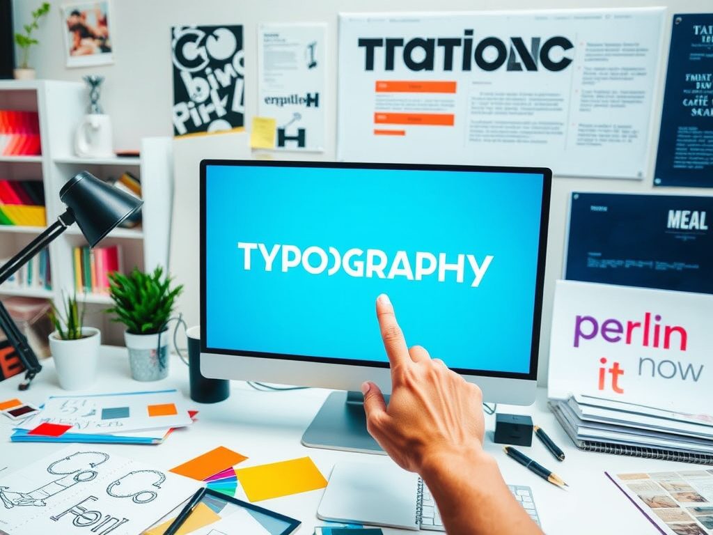
Typography design is an essential aspect of visual communication that goes beyond merely choosing fonts. It is a creative journey that involves understanding how type interacts with images, colors, and overall design elements to convey messages effectively. In today’s digital era, where content is consumed rapidly, mastering typography can significantly enhance user experience and engagement. This blog post explores the intricacies of typography design, offering insights into its principles, trends, and best practices for aspiring designers and enthusiasts alike.
At its core, typography is the art and technique of arranging type to make written language legible, readable, and visually appealing. The choice of typeface, spacing, alignment, and hierarchy all play crucial roles in how information is perceived. A well-crafted typographic layout not only draws attention but also guides the reader through the content seamlessly. Good typography can evoke emotions, set moods, and reinforce branding, making it a powerful tool in any designer’s toolkit.
One of the fundamental principles of typography is hierarchy. Hierarchy is the arrangement of elements in a way that clearly signifies their importance. By varying font sizes, weights, and styles, designers can create a visual hierarchy that leads the reader’s eye to key pieces of information. For example, a bold header in a larger font size immediately captures attention, while body text in a smaller, lighter font provides supporting details. This strategic use of hierarchy helps users navigate through content more intuitively, enhancing their overall experience.
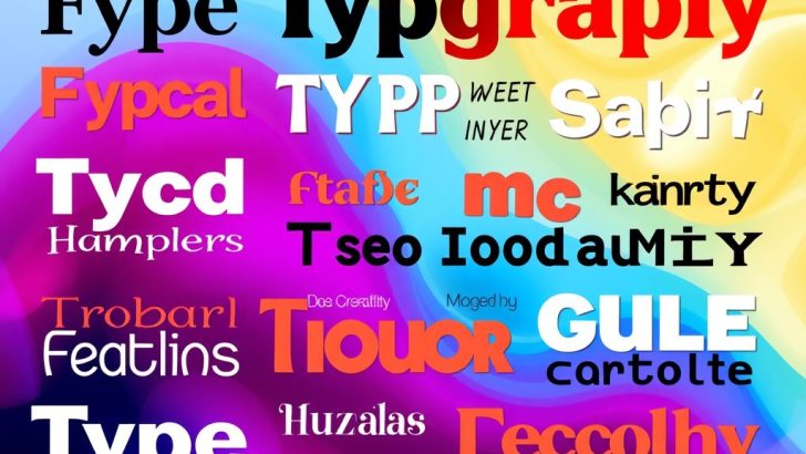
Another critical aspect of typography design is the selection of typefaces. With thousands of fonts available, choosing the right one can be daunting. Designers must consider the message they want to convey and the audience they are targeting. Serif fonts, like Times New Roman, convey tradition and reliability, while sans-serif fonts, like Arial or Helvetica, are often perceived as modern and clean. Decorative fonts can add flair but should be used sparingly to avoid overwhelming the viewer. Ultimately, the selected typeface should resonate with the brand identity and purpose of the design.
In addition to typeface selection, spacing is another vital component of typography. The space between letters, words, and lines—known as kerning, tracking, and leading, respectively—can drastically affect readability. Proper spacing ensures that text is not only legible but also aesthetically pleasing. For instance, too much space can make a design feel disjointed, while too little can create a cramped appearance. Designers must strike a balance to maintain clarity and flow in their typography.
As we move further into 2025, typography trends continue to evolve. One notable trend is the resurgence of bold typography. Designers are increasingly favoring large, eye-catching type that commands attention. This trend is particularly popular in digital media, where bold headlines can entice users to engage with content. Additionally, the use of variable fonts—fonts that can adapt to different styles and weights—allows for greater flexibility and creativity in typography design.
Another trend gaining traction is the integration of typography with illustrations and graphics. This approach creates a dynamic interplay between text and visual elements, making designs more engaging. Designers are experimenting with layering type over images, incorporating hand-drawn typography, and using animated text in digital platforms. Such innovations not only enhance visual appeal but also provide unique ways to communicate messages.
In conclusion, typography design is a multifaceted discipline that requires a keen understanding of aesthetics, functionality, and user experience. By mastering the principles of hierarchy, typeface selection, and spacing, designers can create compelling and effective typographic layouts. As trends continue to shift, staying informed and adaptable is crucial for any designer wishing to excel in this creative journey. Whether you are a seasoned professional or a newcomer to the field, embracing the art of typography will undoubtedly elevate your design work to new heights.
Emily Carter
This post beautifully captures the essence of typography! I love how you emphasized the importance of hierarchy and spacing. It’s fascinating to see how such small details can drastically change the way we perceive text. Looking forward to exploring more about the bold typography trend you mentioned!
Sofia Martinez
What a fantastic read! I appreciate how you explained the interplay between typography and imagery. It’s inspiring to think about how we can create more engaging designs by integrating text with graphics. Thank you for sharing these valuable tips!
Olivia Johnson
This article is a treasure trove of information for anyone interested in design! I love how you broke down complex concepts into digestible pieces. The focus on emotional impact through typography is something I hadn’t considered before. Thanks for the inspiration!
David Lee
I really enjoyed this article! The discussion about variable fonts is so relevant, especially with the current design trends. It’s exciting to think about the possibilities they offer for creativity in typography. Keep up the great work!
James Thompson
Great insights on typography design! The distinction between serif and sans-serif fonts was particularly enlightening for me. I often struggle with font selection, and your tips will definitely help me make better choices in my projects!