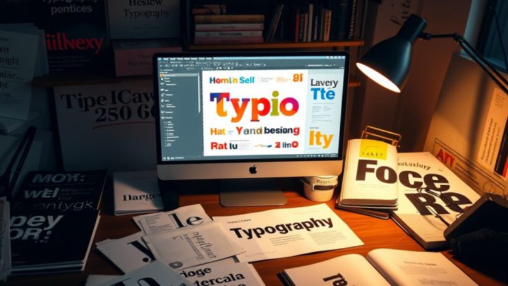
Typography is an essential aspect of design that transcends simple aesthetic appeal; it is a powerful communication tool. In the world of digital and print media, the choice of typeface, spacing, and layout can significantly influence how a message is perceived. As designers, understanding typography is crucial not only for creating visually appealing content but also for enhancing readability and conveying the intended tone and emotion of the message. This blog post delves into the fundamentals of typography design, its history, the importance of good typography, and practical tips for mastering it.
To appreciate typography, it’s essential to understand its history. Typography dates back to the invention of the printing press in the 15th century, which revolutionized how information was disseminated. Initially, typography was solely for printing books and documents, using metal type. Over the years, it evolved into a complex art form with the introduction of various typefaces and styles. Today, we see a myriad of fonts available, each with its unique personality and characteristics, allowing designers to express their creativity while adhering to the principles of good typography.
One of the key elements of typography is the typeface itself. A typeface is a specific design of lettering that can include variations in weight, style, and size. For instance, Serif typefaces, like Times New Roman, have small lines or embellishments at the end of strokes, which can evoke a sense of tradition and reliability. In contrast, Sans-serif typefaces, such as Arial or Helvetica, offer a more modern and clean look. Choosing the right typeface is critical because it sets the tone for the entire design. For example, a playful font might be appropriate for a children’s book cover, while a more formal typeface would be better suited for a corporate report.
In addition to selecting the right typeface, spacing plays a crucial role in typography design. This includes letter-spacing (kerning), line spacing (leading), and the space around paragraphs (margin and padding). Proper spacing enhances readability and ensures that the text flows naturally. For instance, too much letter-spacing can make words difficult to read, while insufficient line spacing can lead to a cramped appearance, discouraging readers from engaging with the text. As a general rule of thumb, designers should aim for a harmonious balance in spacing to create an inviting and legible design.
Another essential aspect of typography is hierarchy. Hierarchical structures help guide readers through the content, emphasizing the most important information. This can be achieved through varying font sizes, weights, and styles. For example, using a bold font for headings and a lighter font for body text creates a visual distinction that helps readers navigate the content more efficiently. Establishing a clear hierarchy not only improves usability but also ensures that the message is communicated effectively.
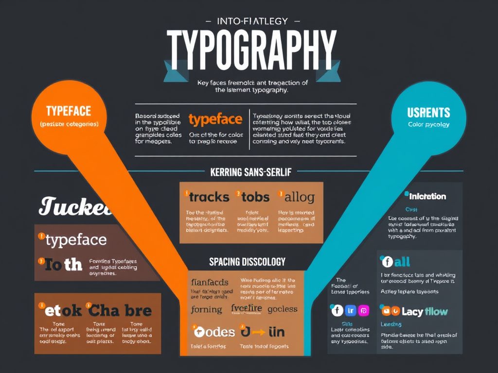
Color is another crucial factor in typography design. The color of the text can evoke different emotions and influence the overall perception of the design. For instance, red might convey urgency or passion, while blue can communicate trust and calmness. When choosing colors, designers should also consider contrast to ensure legibility. High contrast between the text color and the background makes it easier for readers to engage with the content, while low contrast can make it challenging to read, especially for individuals with visual impairments.
Incorporating typography into your design doesn’t have to be daunting. Here are some practical tips to help you master typography:
1. **Study the basics**: Familiarize yourself with typography terminology and principles. Understanding the anatomy of type, such as ascenders, descenders, and x-height, will enhance your appreciation and ability to work with fonts.
2. **Experiment with combinations**: Don’t be afraid to mix and match different typefaces. However, aim for contrast rather than conflict by pairing a serif font with a sans-serif font to create a visually appealing design.
3. **Use grids**: Implementing a grid system can help maintain alignment and consistency in your typography. Grids provide a framework that ensures your text is organized and easy to read.
4. **Test your designs**: Always preview your typography on various devices and in print to ensure it looks good in different contexts. Testing helps identify any potential readability issues.
5. **Stay updated**: Typography trends change over time. Follow design blogs, attend workshops, and engage with other designers to stay informed about new typefaces and styles.
In conclusion, mastering typography is an indispensable skill for any designer. It not only enhances the aesthetic quality of your work but also plays a pivotal role in effective communication. By understanding the history of typography, selecting appropriate typefaces, managing spacing, establishing hierarchy, and utilizing color thoughtfully, designers can create impactful and engaging designs that resonate with their audience. Remember, good typography is not just about choosing attractive fonts; it’s about conveying a message clearly and beautifully. Embrace the art of typography and let it elevate your design projects to new heights.
Emily Carter
This post is a great reminder of how crucial typography is in design. I often find myself overwhelmed by the number of typefaces available, but your tips on combining fonts are super helpful! Thanks for sharing!
Sophia Lee
I love how you explained the history of typography! It’s fascinating to see how far we’ve come from the days of the printing press. Your practical tips are invaluable for anyone looking to improve their design skills.
David Johnson
Great article! As a beginner, I really appreciate the breakdown of typefaces and their emotional impact. I’m excited to apply what I’ve learned about color contrast in my designs.
Olivia Martinez
This is such a comprehensive guide! The section on hierarchy helped clarify some things I’ve struggled with. I’ll definitely be keeping these tips in mind for my future projects!
Michael Thompson
Fantastic insights! I never realized how much of an impact spacing can have on readability until now. I’ll definitely be experimenting with line spacing in my next project!